The Psychology of Neutrals: Why a Calm Workspace Enhances Focus
Our relationship with colors begins long before we can even name them. As children, we learn to pair colors with a certain vibe. Then as we grow, those associations deepen, so by adulthood, our preferences are more than just favorite colors, they become part of our daily habits.
This relationship has reached its breaking point in the contemporary world. We live in an era of color psychology where every brand and icon is engineered to grab our attention. While useful, this approach can flatten color into a formula. On top of that, we're navigating endless notifications and visual symbols competing for our attention. We've reached a saturation point where we are constantly absorbing signals we didn't ask for. This leads to a kind of sensory burnout that makes it difficult to find a moment of true focus.
This isn't just a modern theory; it’s a fundamental truth of design that has long been recognized by experts. Pop culture has given us one of the most memorable illustrations of how deeply color influences us. In The Devil Wears Prada, Miranda Priestly delivers her famous "Cerulean Monologue," explaining how a specific shade of blue, chosen by a handful of people in a room, eventually finds its way into a discount sweater at a mall. She highlights a crucial point: no color is ever accidental. Each one carries intention, history, and influence.
Which brings us to the present moment. You may have heard about the Millennial Gray and the shift toward muted palettes. But the shift toward muted, neutral palettes wasn't born from a lack of imagination. In a world that is loud and demanding, we’ve started to curate our environments to act as a blank canvas. Understanding this shift in context sets the stage for a deeper look at neutral colors.
To make the most of these neutral tones, let's move beyond the basic ideas we've picked up along the way. Explore how they stand apart from bolder hues, clear the mental clutter, and let you layer in just enough warmth and character to keep every space feeling welcoming and lived-in.

What Color Psychology Actually Tells Us
The research on color and cognition isn't exactly new. In fact, studies dating back to the mid-twentieth century were already exploring how wall colors affected factory workers' productivity. The science has been there for decades, but what’s actually new is the thoughtful application of these findings to our daily environments.
When we look at the palette itself, warm neutrals like soft whites, taupes, muted terracottas, and the gentle green of a eucalyptus each serve a specific purpose. We use them as a visual foundation, to stop the brain from processing more stimuli so we can settle into a state of flow. On the flip side, highly saturated colors like bright reds, electric blues, and neon yellows are designed to catch our attention. In a workspace, they essentially act like pop-up ads for your peripheral vision.
Beyond the marketing, we need to rethink what color positivity actually means. There is a common assumption that a palette has to be bright or bold to be uplifting, but emotional impact isn't tied to intensity. It’s actually about the relationship you have with a shade.
In a workspace, positive colors are the ones that provide emotional stability. A muted, dusty pink can feel nurturing and safe, while a deep, earthy brown feels grounding and inviting. These tones provide a sense of calm that allows you to feel centered. This is where philosophy meets the physical.

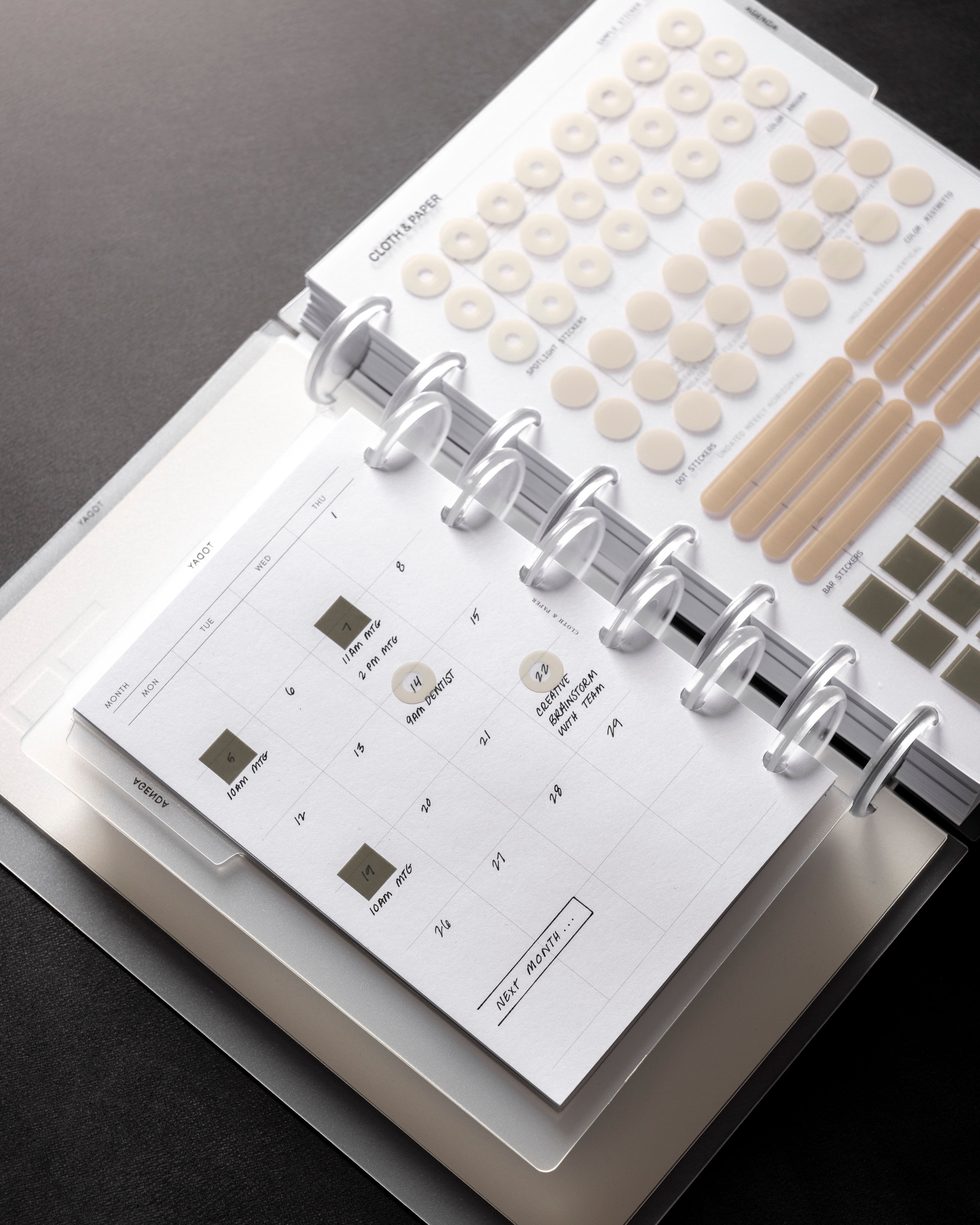
The Cloth & Paper Palette in Practice
There is a particular pleasure in curating a space that can be both beautiful and functional without those two qualities ever being at odds. It’s found in the small, grounding details that anchor a space. You can add the soft green of a succulent in a matte ceramic pot, the warm ivory of handmade paper, or the subtle texture of a woven leather cover adds an organic warmth to the scene.
At its core, the Cloth & Paper aesthetic is an exercise in the quiet luxury of restraint. It is a philosophy built on the idea that beauty and substance are not mutually exclusive. When you choose a curated neutral palette, the minimalist look isn’t the only goal. You get to choose the pieces that belong in your space. Sometimes, it’s a clean notebook cover in a shade like Stark or Pebble that feels cool to the touch. Other times, it’s a muted desk mat that defines your workspace without overwhelming it. Even a single, weighted pen in matte black or brushed gold becomes a statement.
Neutrality in your tools serves as a canvas. When your space and tools are calm, your thoughts are finally allowed to be the most vibrant thing in the room. If they feel sophisticated and disciplined, you’re much more likely to approach your tasks with that same level of gravity.

Curating Your Visual Field
Understanding the psychology behind neutral colors is one thing. Applying it to the spaces where you actually work, plan, and think is where the real transformation happens.
You don't need to overhaul your entire life or invest in a full home makeover to enjoy the principles we've explored. Here are a few practical ways to reduce visual noise starting today.
1. Consider what has actually earned its place on your surface.
We often let objects stay on our desks simply because they’ve always been there. Look at your workspace and ask if each item serves a genuine function or provides a moment of clear, aesthetic calm. If a tool doesn’t inspire you or help you finish the task at hand, it’s likely just visual noise. A clear surface isn't about emptiness; it’s the essential foundation for a clear mind.
Quick Tip: If you aren't sure where to start, take a photo of your room. It is often easier to spot "noise" in a 2D image than it is when you are standing in the middle of the space.
2. Consolidate your tools into a single color family.
Take stock of the stationery you reach for most. When your desk is a jumble of bright and mismatched colors, it’s hard for your eyes to find a place to rest. Every neon clip or branded pen is a tiny tug on your attention. By narrowing your tools down to a few quiet, earthy tones like a warm grey, a soft taupe, or a deep charcoal, the clutter starts to fall away. Your pens and planner begin to feel like a matched set, turning a scattered surface into a steady, unified place to work. When your tools share a visual language, the friction of switching tasks disappears.
3. It’s also worth swapping out loud, branded containers for more organic textures.
We often overlook the stress caused by promotional clutter, the bright plastic file holder or the neon coffee mug from a past event. Replacing these with uniform solutions, like woven baskets, linen-bound boxes, or leather catch-alls, creates an immediate sense of order. When your storage looks like it belongs to the room rather than competing with it, the overall effect is one of effortless composure.
4. Let one beautiful object be the focal point.
A neutral workspace shouldn’t feel sterile. Choose one object that brings you joy to serve as the focal point. It might be a luxuriously textured planner cover, a small ceramic vase holding a single stem, or a heirloom-quality pen. By limiting the special objects to just one or two, you allow them to hold weight. They become anchors of beauty rather than contributors to clutter.
These practices are just the beginning. Because once you start noticing how much visual noise you've been carrying, a larger question emerges: what else in our lives have we mistaken for necessity?

Beauty as a Form of Focus
There’s a common misconception that meticulously curating your workspace is a form of vanity. But in reality, the opposite is true. Choosing beauty in your environment is a quiet, deliberate act of self-respect. It signals to your brain that the work happening here, and the person doing it, matters.
We often think we need a pop of color to feel inspired, but a busy desk can actually be exhausting to look at. When your stationery is muted and simple, it stops being a distraction and starts being a canvas. This becomes a physical manifestation of your priorities. It only proves that you value depth over distraction especially since it is the environment where your best ideas are born.
We began by learning that colors carry feelings. Perhaps the final lesson is learning which feelings we actually want to carry.

You may also like

Leave a comment
This site is protected by hCaptcha and the hCaptcha Privacy Policy and Terms of Service apply.